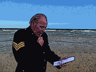
My First attempt to my final image.
This image bright and colourful which would be expected in a story book but it looks too much like a photograph still and that is not the objective of the project. I like the part of the tunic were you can see the detail on it. I also like the sea because it has been captured while the waves are starting to break.
My Tutors attempt at designing my image.
I think the image looks too dark and grainy for a story book image. I like the idea of seeing the detail in the models face and on the note book. Half of the image looks black and white, for a story book type effect this will not look good enough for me.
My Second attempt at cartoonising my image.
This image shows most of the detail in the models face and the sea, there is still some colours in the image that makes the image belongin a story book. I think that the image has turned out better than I expected.


No comments:
Post a Comment
Thank you for taking your time to comment on my work I will get back to you asap.